2020 was a weird year due to the pandemic. Many students struggled to find an internship but, luckily, Association of Registered Graphic Designers (RGD) took one step forward and came up with a new internship edition which I was very glad to be part. My mentor was Vincent Galante, who patiently showed me the process and questioned all my thinking behind my choices for this project.
Overview
The Project Brief: The Bonne Bay Marine Station is a known research and teaching facility located in Newfoundland and Labrador. Climate change is affecting the marine environment, and they want to educate people on this topic by bringing an exhibit which will have two iPads.
The Challenge: An app will be developed to explain and teach people about climate change. The exhibit will appeal to all age groups, but the main target audience will be students between 12-14 years old. It is also important to be user-friendly and accessible.
The Goal: Go through the learning process of organizing the information content, wireframing, designing and prototyping the app in a consistent way with the brief.
Information Architecture
My first step was to understand all the content that was provided for this project and propose a content hierarchy that made sense of this information.
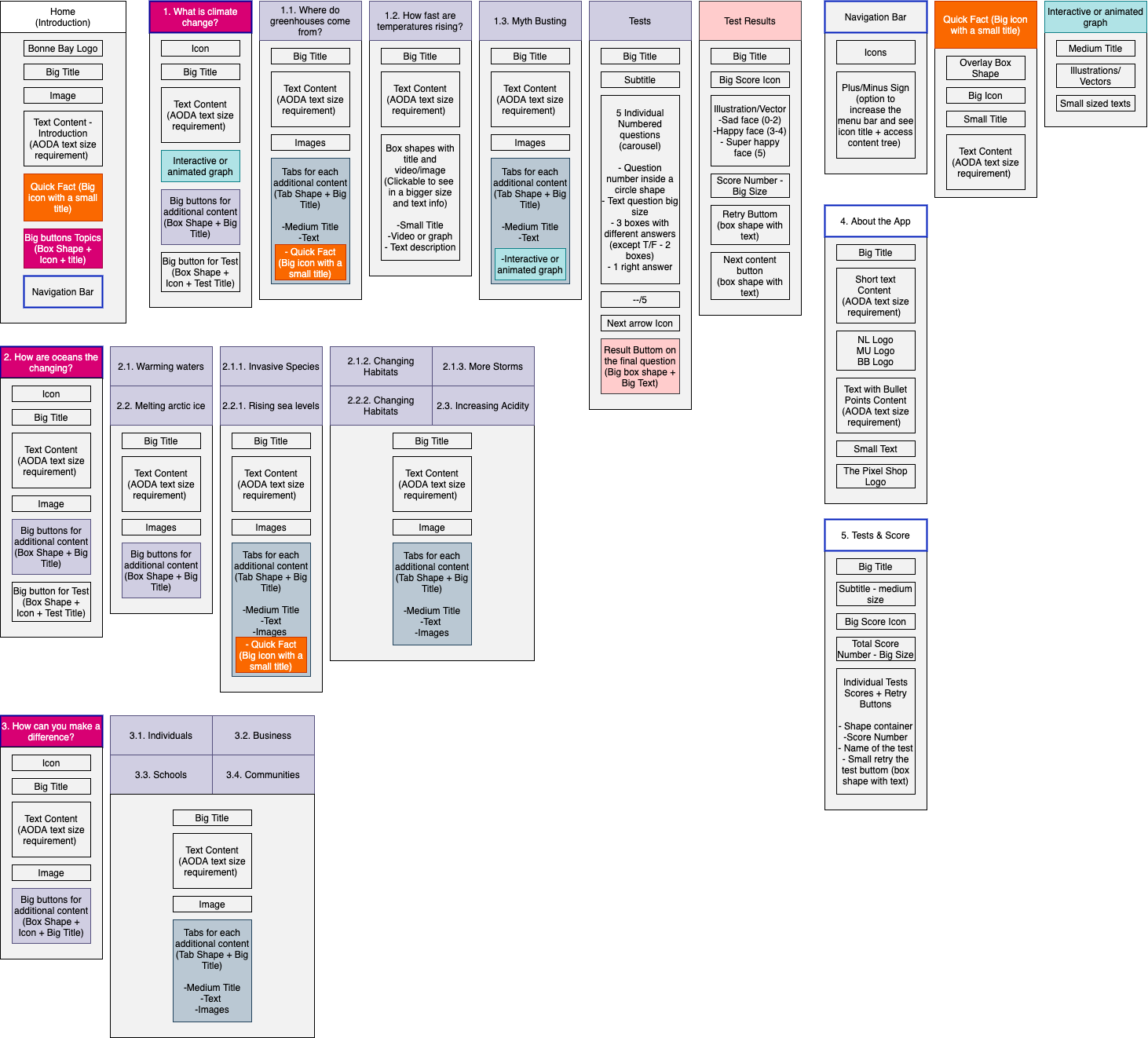
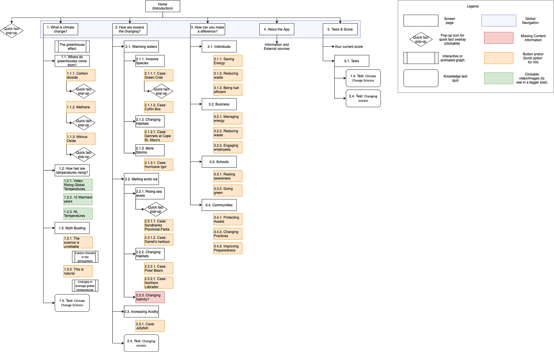
For my first wireframe, I had a few ideas I wanted to implement and also a simple structure to follow. However, after discussing with my mentor, I was able to understand that a few points I had in mind could be troublesome for the users. Besides, I also needed to think about how to make the process easier for users.

As I progressed with the wireframes, I got rid of a few features that were not relevant or necessary. I was also challenged to make a layout that people didn't have to scroll down to access the information they needed, which I found to be very convenient and satisfying.
Design
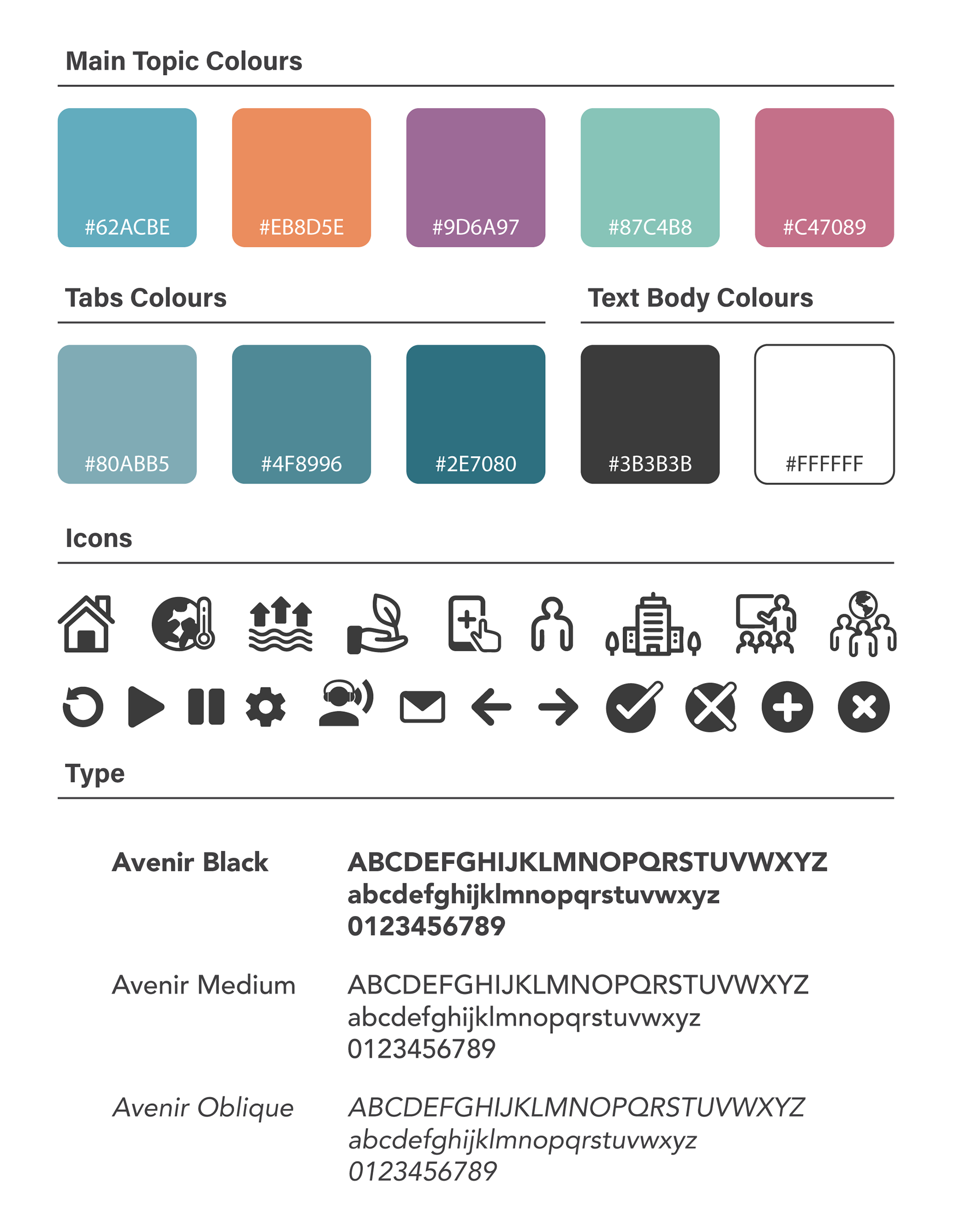
I opted to go with a layout and colours that could grab the attention of teenagers. So I chose colours that had good contrast. I also aimed to use colours that could help colour blind people to differentiate them and go through the pages with no problems. Below, there is the colours choices, icons and fonts for this project.
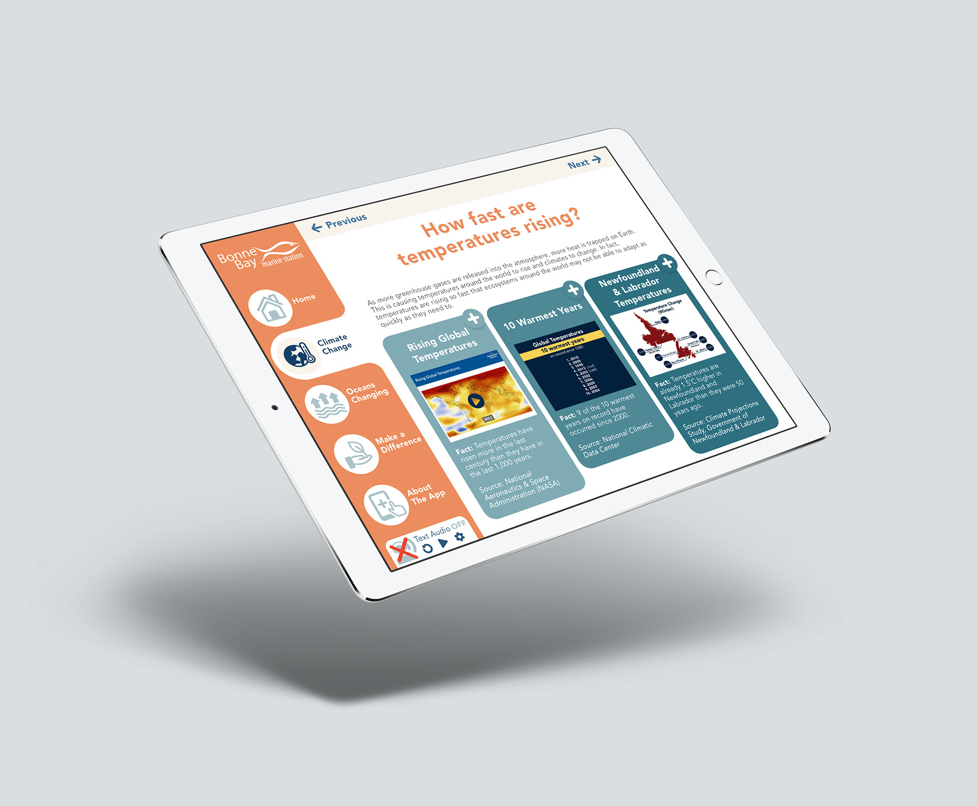
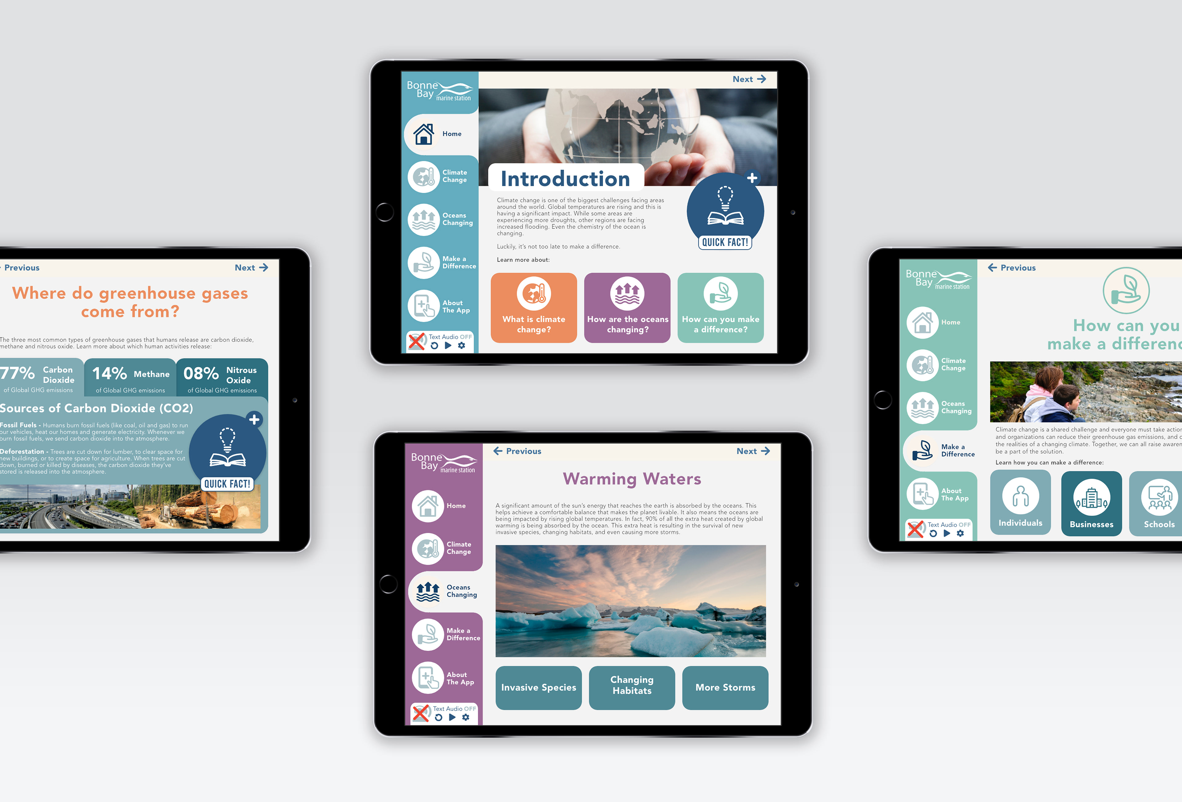
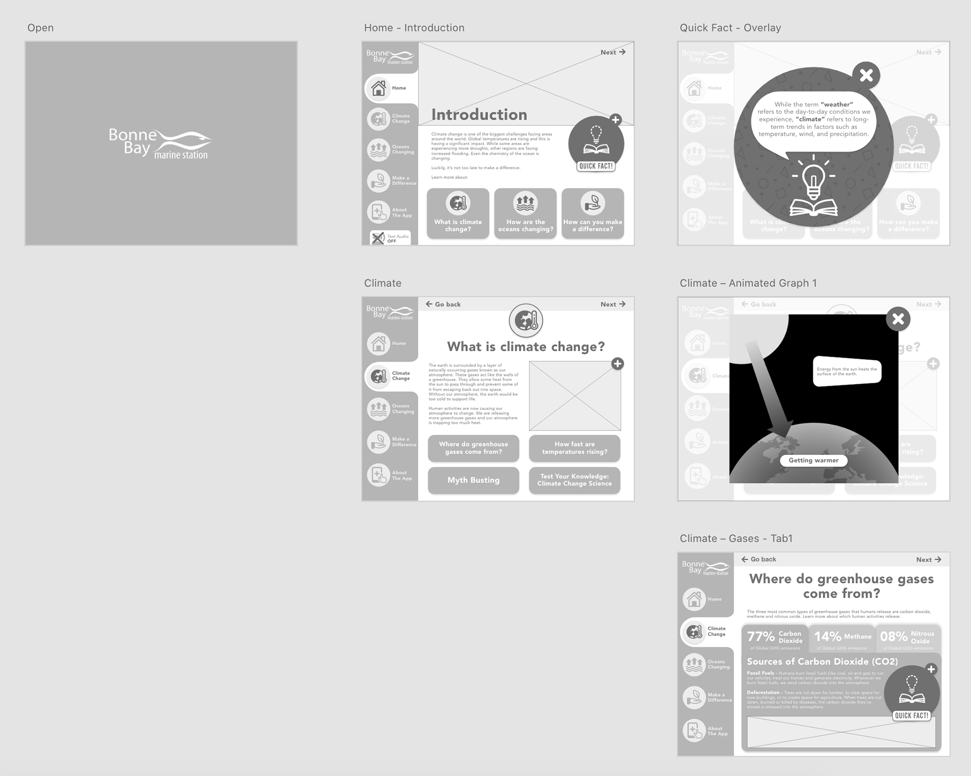
Navigation & Screens
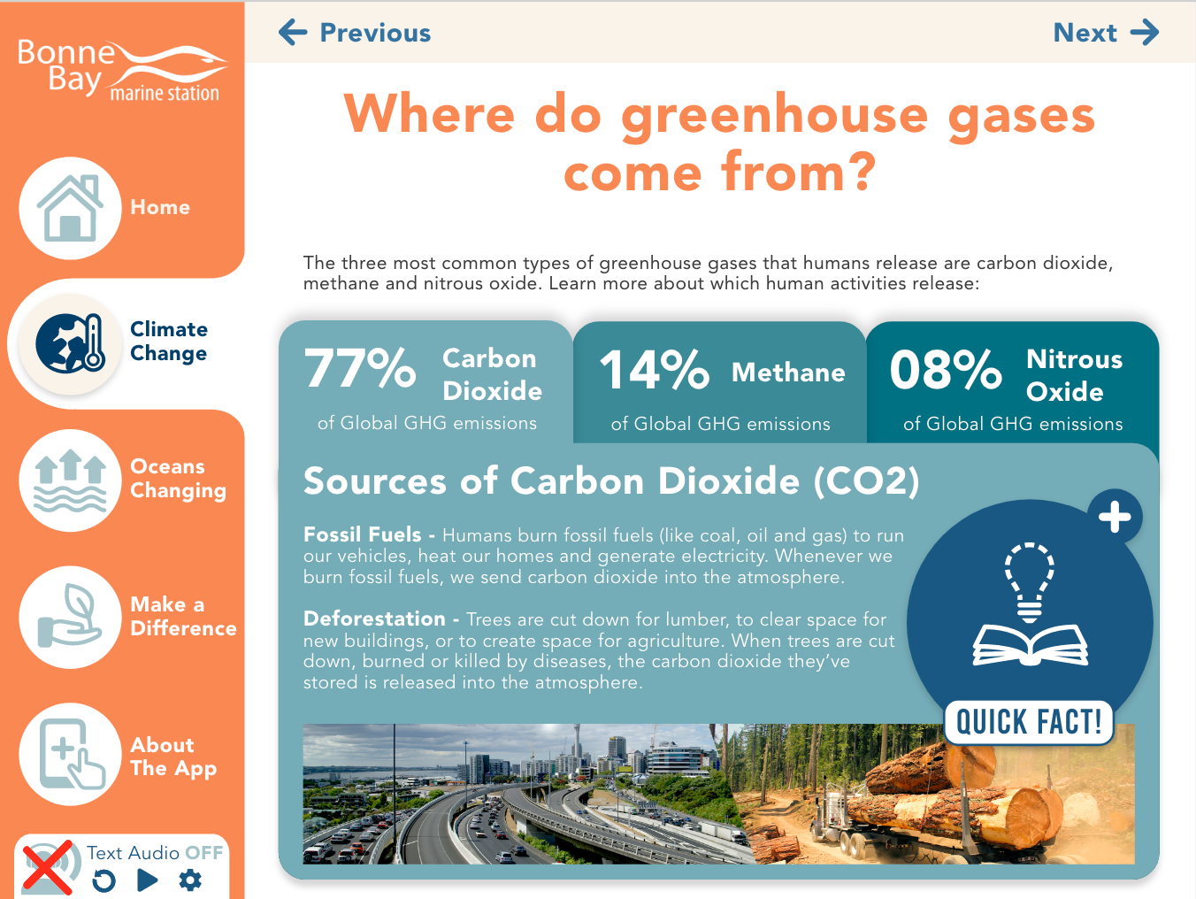
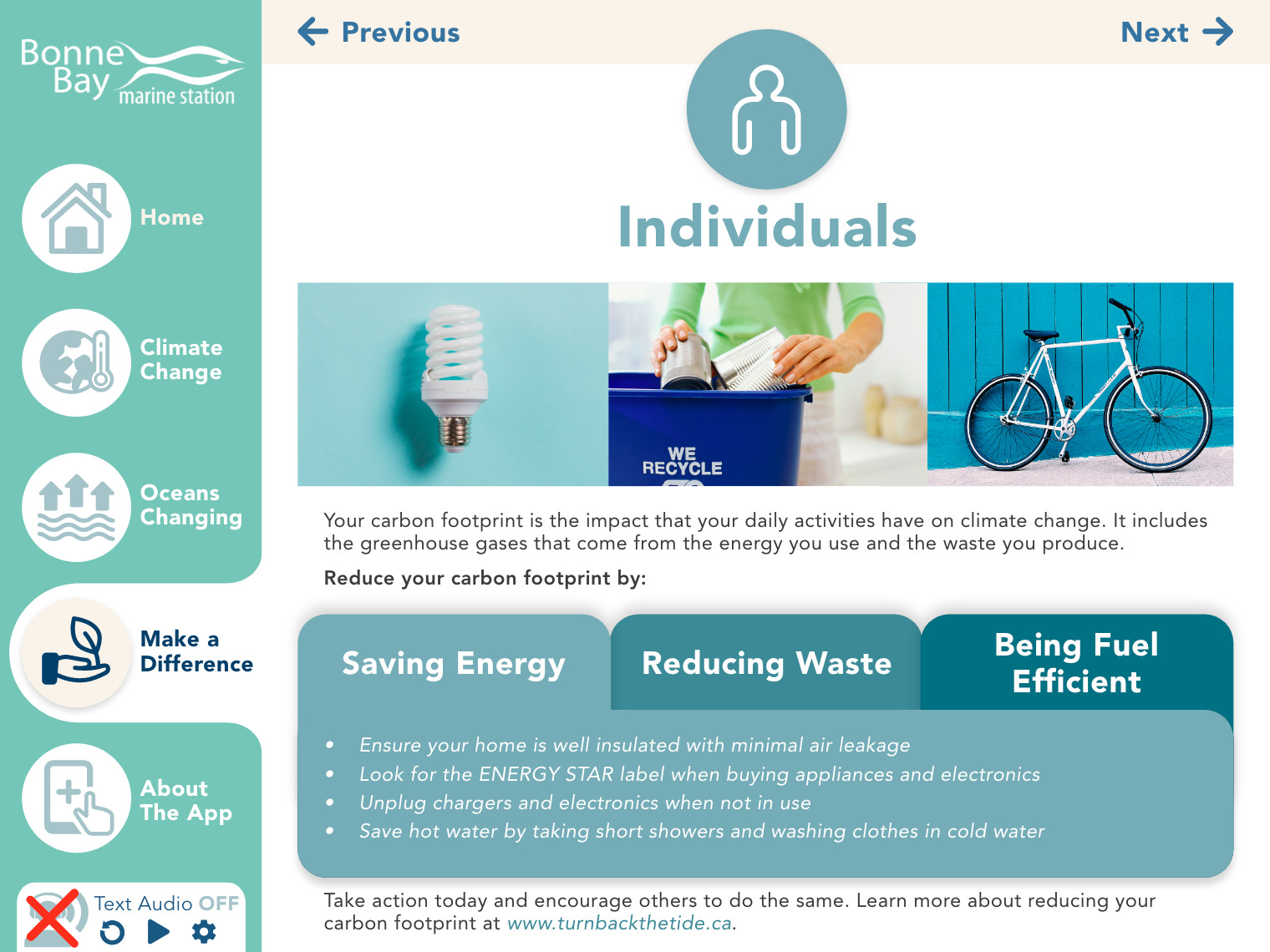
The navigation bar of this app is fixed, very simple and intuitive. There are an icon and a small title to represent each main topic page. Besides, each main topic will also have a specific colour assigned.
Some of the content was organized within tabs. This allowed to have a higher amount of information together, an easier transition of the content for the user, and avoid creating extra pages for each smaller topics.
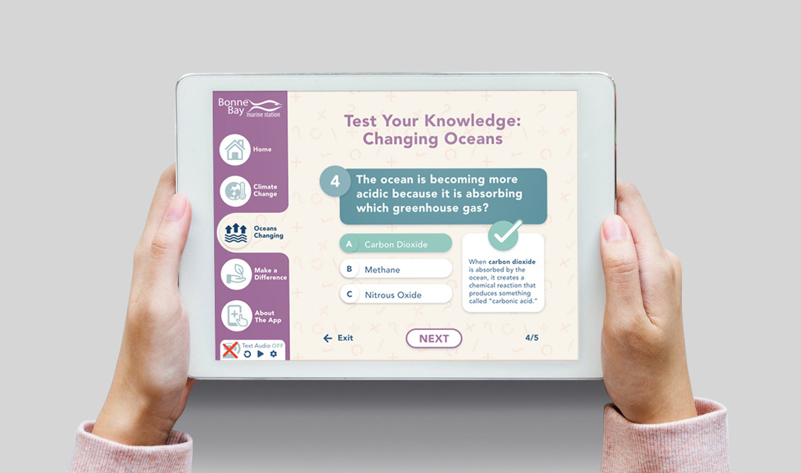
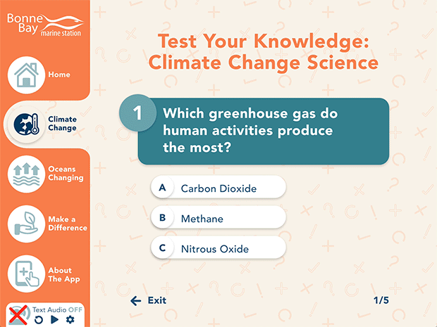
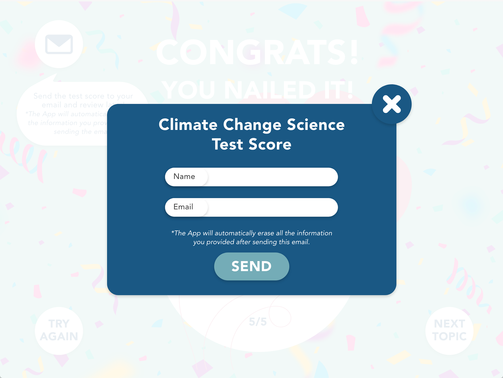
The app will have knowledge tests about the content presented. After the user gets his result, he will have an option to send the result and answers of this test to their email. This will allow them to properly see which questions they got wrong and analyze the right answers properly.
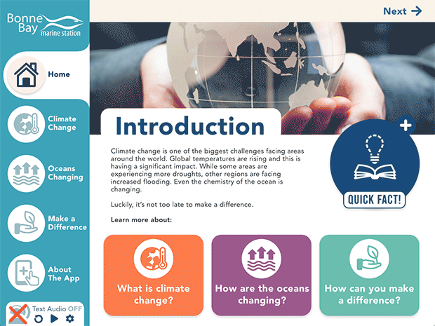
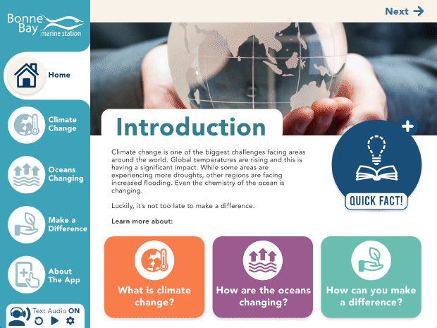
There is also a text reader feature for people with vision impairment which can allow them to hear the content on the page selected.
Project Learnings
- Analyzing the content, classifying the type of information and organizing them by hierarchy was an important learning step for me. This process makes it easier for you to understand the best flow for the content and navigation. This will also help you develop a solid start base for your wireframes.
- Understanding the importance of simplifying things. If you overcomplicate things, the user easily loses interest or might get lost in the tasks.
- Developing empathy and understanding the user is important to solve the problem. User testing is the best way to have insights on how they use your app and find key points to improve the functionality of the product.
- Understanding why you made certain choices and their purposes within the app.