Logo Design - 2019

The objective was to create a logo for Katayama & Kaneko Advogados, a well-established law firm in Sao Paulo, Brazil. Both lawyer associates have a Japanese background and this was one of the main points to be considered for their logo design as many of their clients also identify themselves as "Nikkei" or "Nikkeijin".
The sketches below show the three different main options presented to the client. All of them take into consideration the Japanese background, which I chose to represent using the red circle that represents the sun.
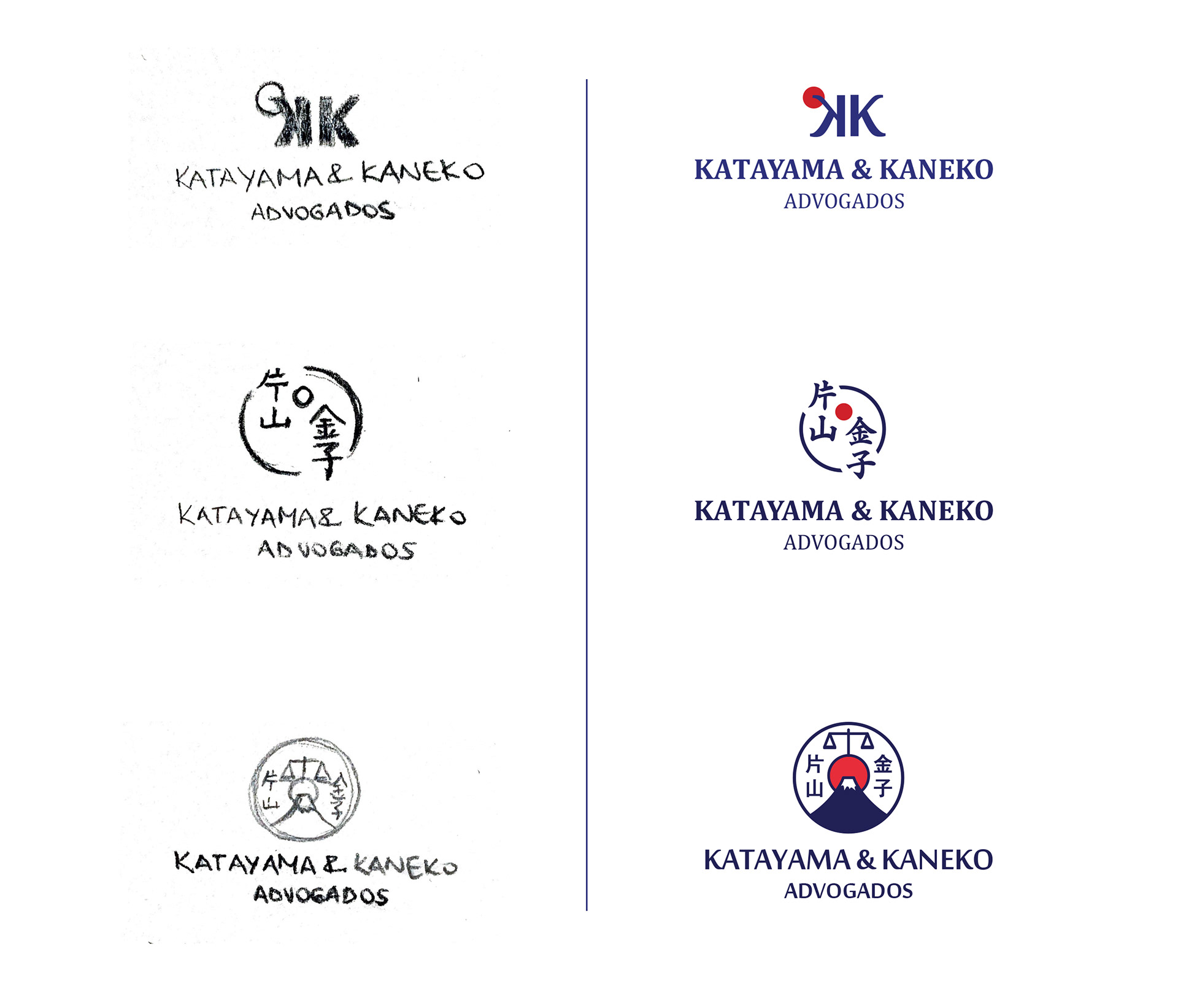
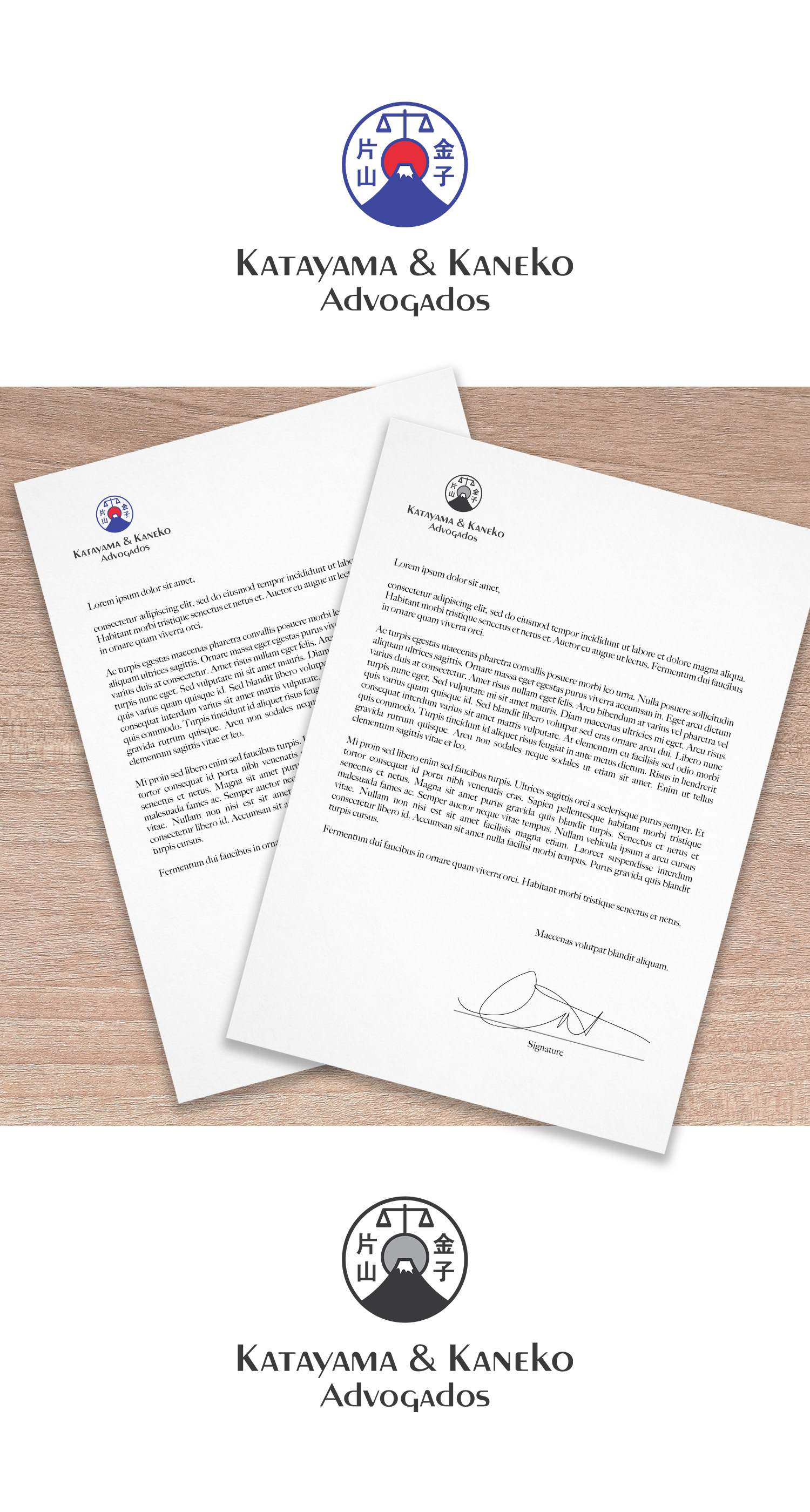
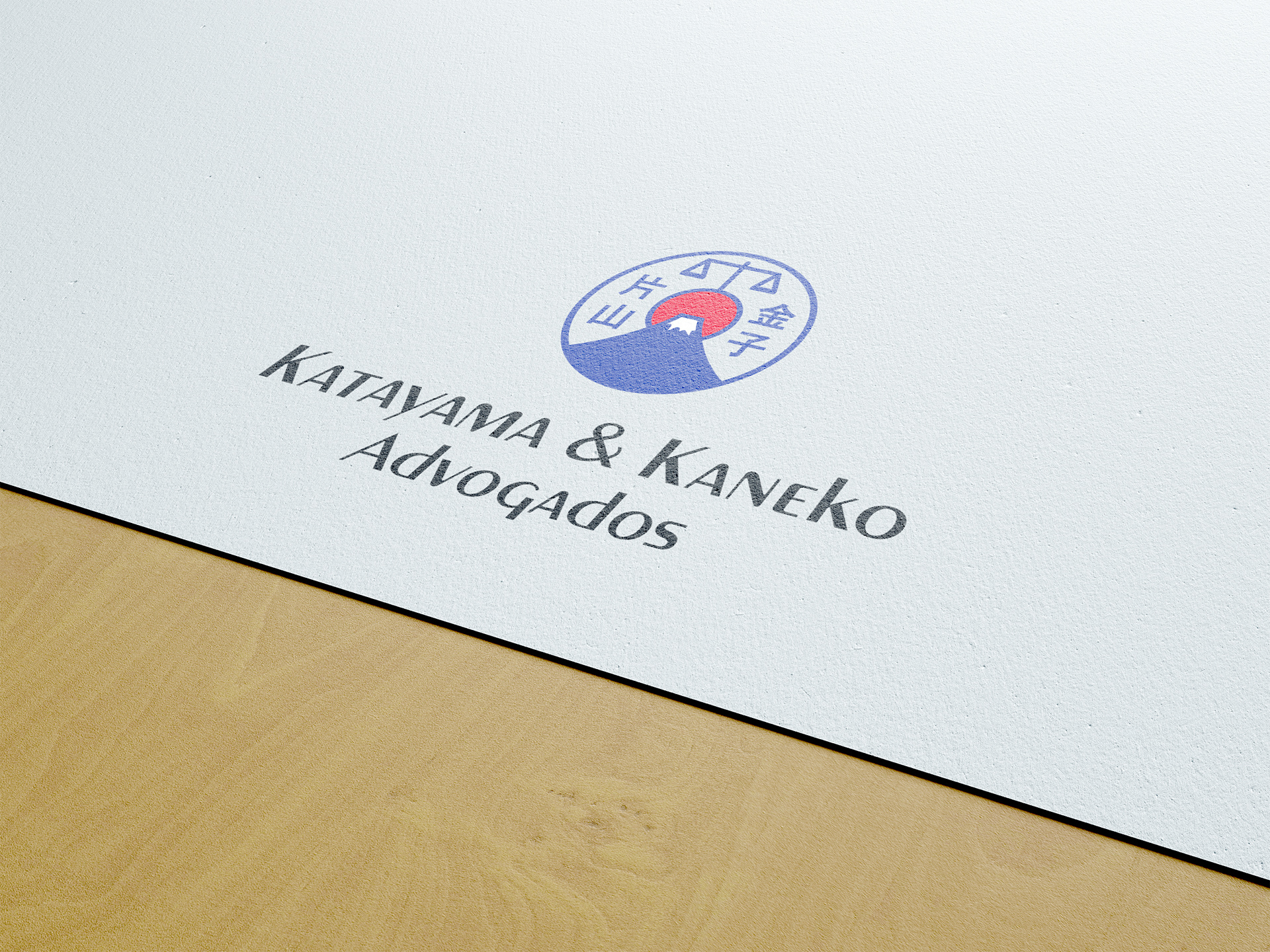
The chosen logo was inspired by Mount Fuji, one of the most iconic places in Japan, and the scale of justice, the symbol that greatly represents lawyers. The red round shape represents the sun and it connects both of the symbols together. Ideograms with their names were also added to the logo design.
The blue color was chosen to represent trust and safety. And the red, in contrast, to give more strength and remember the red color of Japan's flag.