Project created during Humber College Program 2019
Some people see negatively the tarot cards. It can be due to their beliefs, religion, a problem they see in tarot business or a misconception they have about the topic. I like to see it as a form of entertainment to have fun reading and interpreting cards for family or friends.
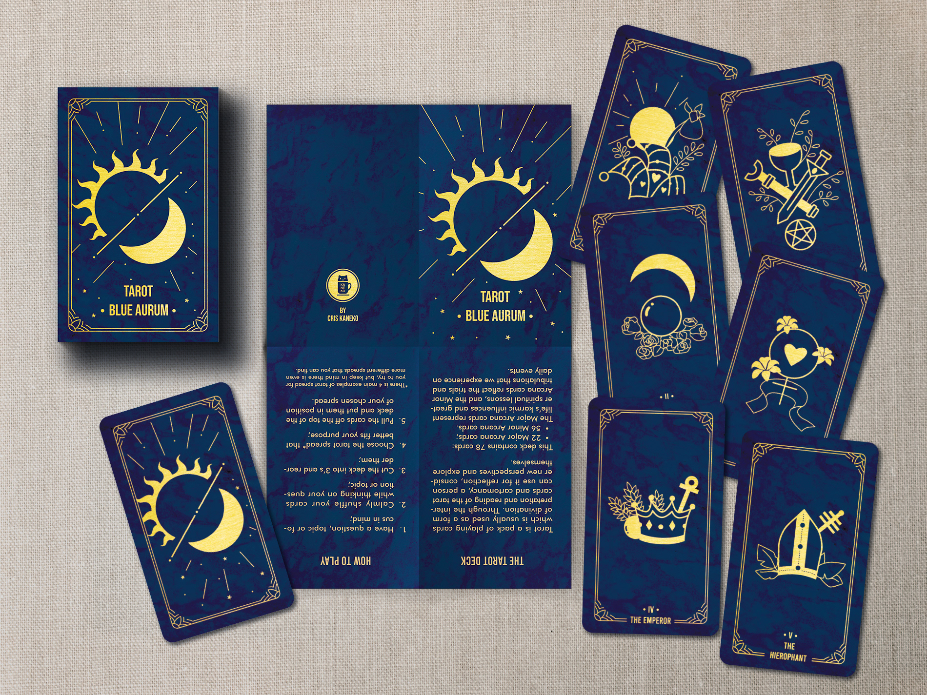
This was a personal project that I was very happy to work on at Humber College. The goal was to design two promotional pieces applying printing techniques. So, when this project was assigned, the first thing that came into my mind was my interest in Tarot cards. And also the desire of having my personalized deck with nice and interesting imagery. So my objective was to make: 6 playing cards and a package for the deck for this project. This was an interesting project for the challenges I had to face and problems the appeared during the process.


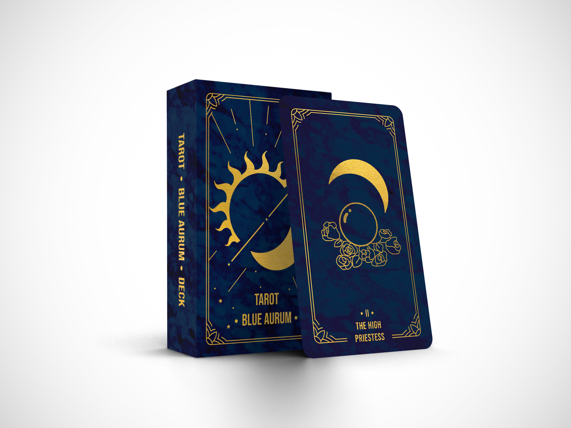
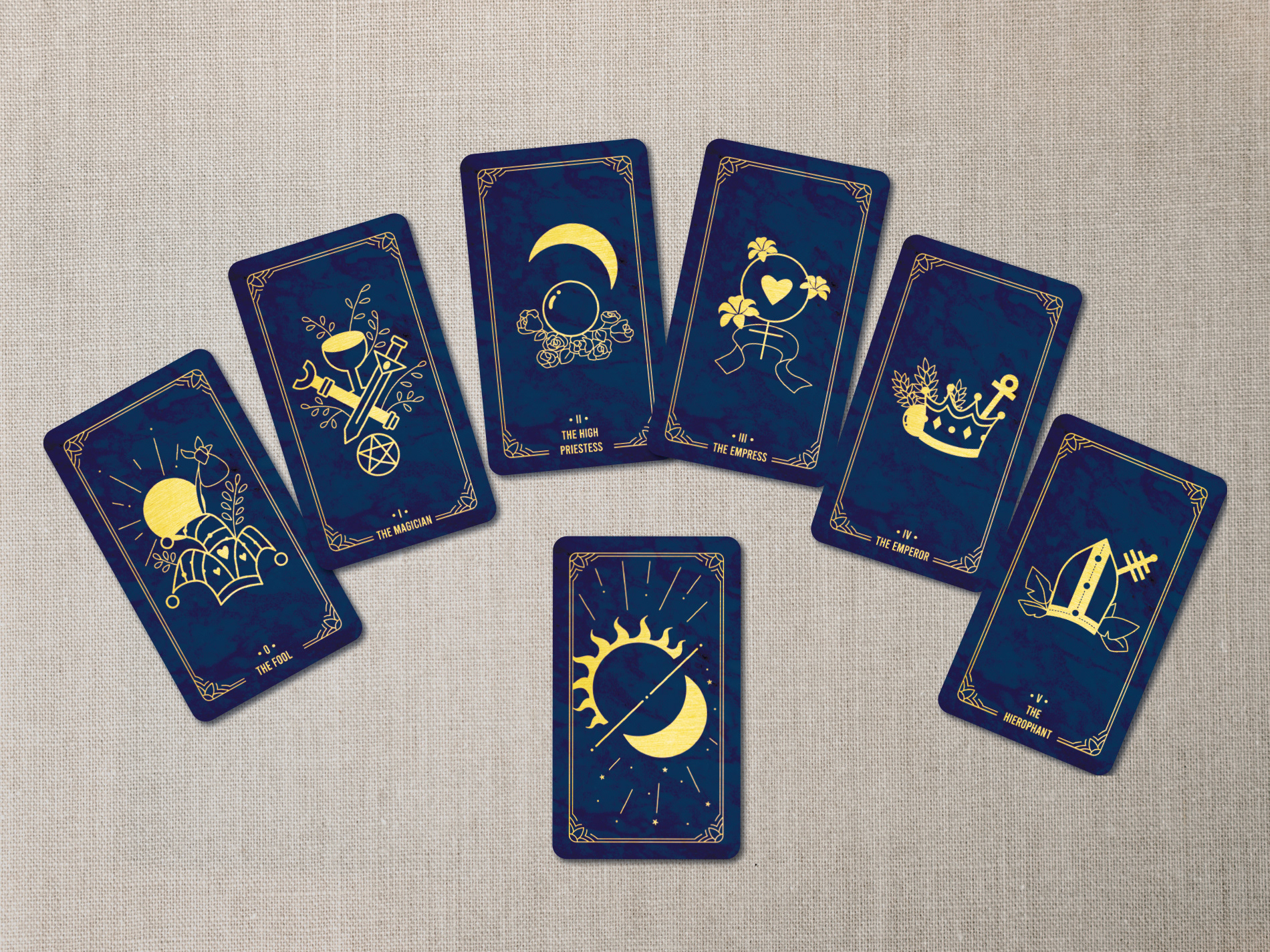
Tarot Cards
I was inspired by the different layouts, beautiful illustration and designs that can be applied in Tarot Cards. Each card has 2.75” x 4.75” (70mm x 121mm) standard size. They all have simple illustrations with the main symbols that can be easily understood and be related to each card. A sans serif font was used in the cards, Bebas regular, and for the colours a dark blue and gold to have good contrast.
Printing Techniques: Dieline to have rounded corners; hot metallic gold foil for the drawings and font.
Challenges for the assignment: Vectorizing my hand drawings and giving the right weight.
Folded Brochure
The brochure is an extra piece for this project. I made this brochure containing brief information about tarot, how to play and 4 different tarot spreads for the player. The colours and title fonts used follows the same concept as the cards and the packaging. The font for the text used in this brochure is Futura medium.
Printing Techniques: Spot colour for the text and cards shape; hot metallic gold foil for the drawings and font in the cover and back cover.
Challenges for the assignment: Faced some problems with the InDesign software with a preflight error in my numbered text.

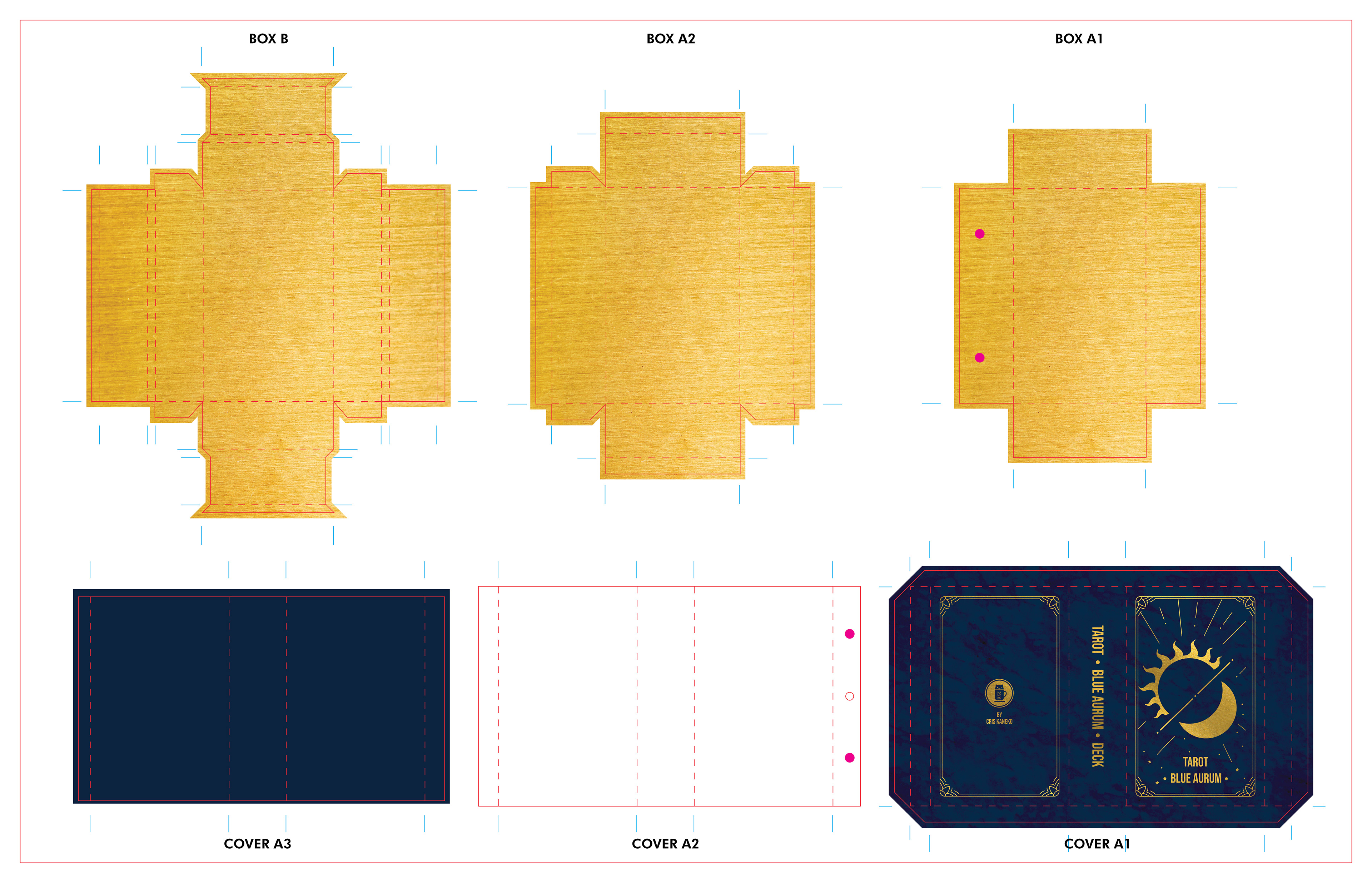
Packaging
The packaging will be like a rigid box to protect the cards with the exterior design following the same concept of the cards, fonts and colours.
Printing Techniques: Dieline; hot metallic gold foil for the drawings and font.
Challenges for the assignment: The proper paper for packaging and difficulties putting magnets on it (for the physical mockup I had to attach the magnets outside the packaging).